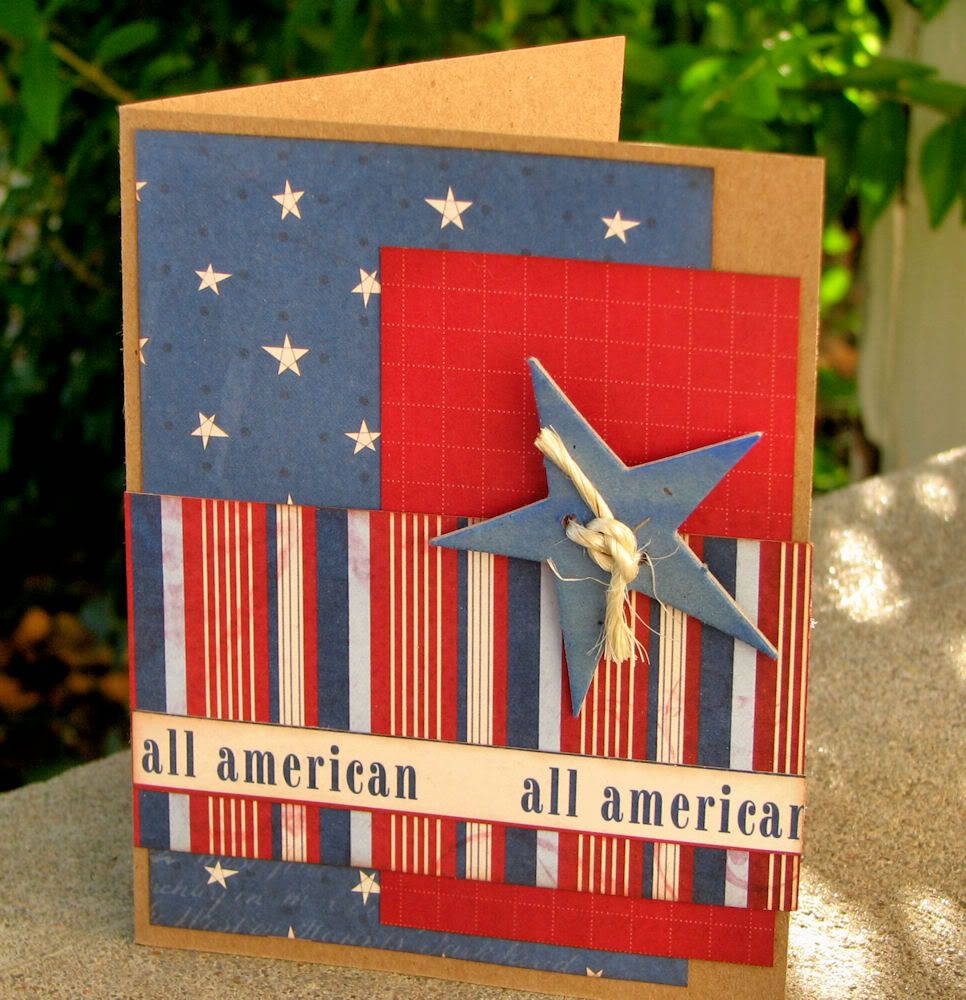
Than never, right? I made this card for the June issue of SNR. I really wanted to remind people that sometimes less is more. This card has very simple lines, not a lot of fussy detail, and I think that is what makes it work. Tip: Look at your paper for key design elements. In this case, my sentiment strip is straight from my paper. It saved time, and looks oh-so-coordinated.
Supplies: Kraft paper; Scenic Route, Bazzil, Whispers Ink, Twine.
Tuesday, September 1, 2009
Better Late
Labels:
Cards,
Scrapbook News and Review
Subscribe to:
Post Comments (Atom)


No comments:
Post a Comment